It’s no surprise that the majority of my favourite websites come from digital agencies, just look at how responsive the design is! A big plus to any of the sites using Helvetica font, mine and Leah’s all time favourite font.. Is it normal to have a favourite font?
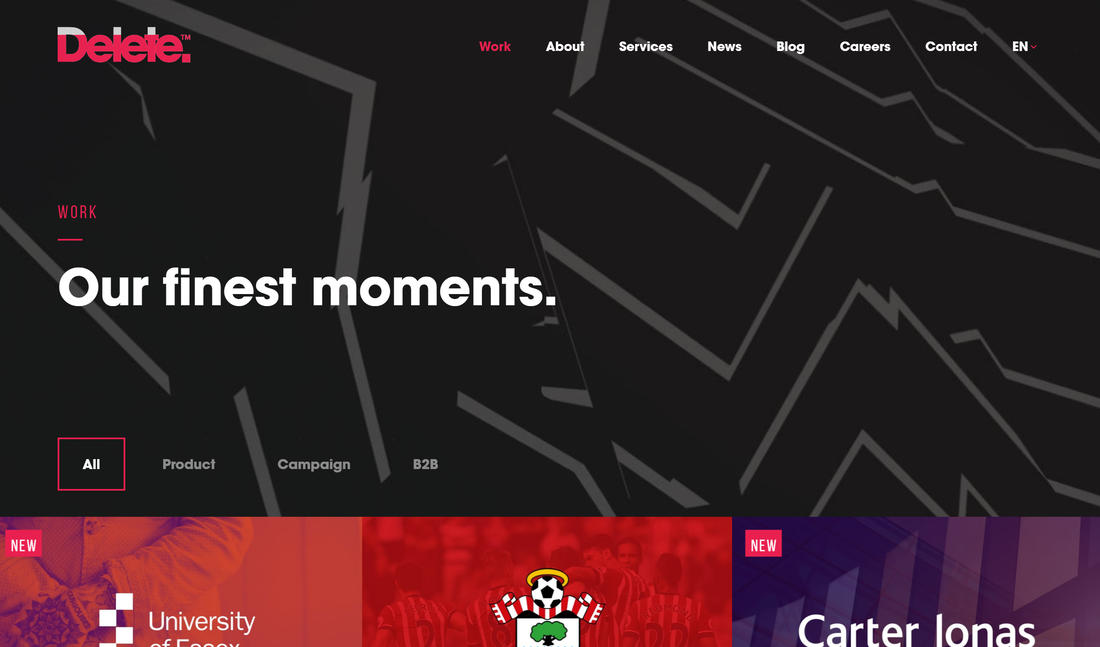
First on the list is Delete, a London Digital Agency. Admittedly I found myself hovering over the logo for a good few minutes, it’s incredibly satisfying. It’s simple and incredibly user friendly, just keep scrolling down on the about section and watch the X’s move…
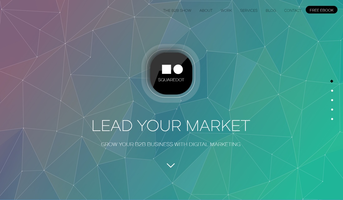
Next comes Squaredot, a digital marketing website. Just look at how beautiful the colours are and how seamlessly they change as soon as you arrive at the page, and the geometric lines work a treat. Scroll down and you’ll see the beautiful graphics on the left hand side of the page and how each page has a different colour theme!
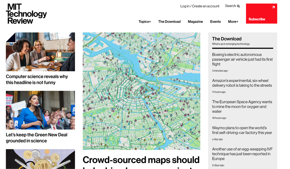
Now this is one most of you will have seen before, the famous MIT Technology Review. Helvetica at it’s finest and a simple colour scheme showing that a website doesn’t have to sing and dance to be aesthetically pleasing, combining tech and incredible design.
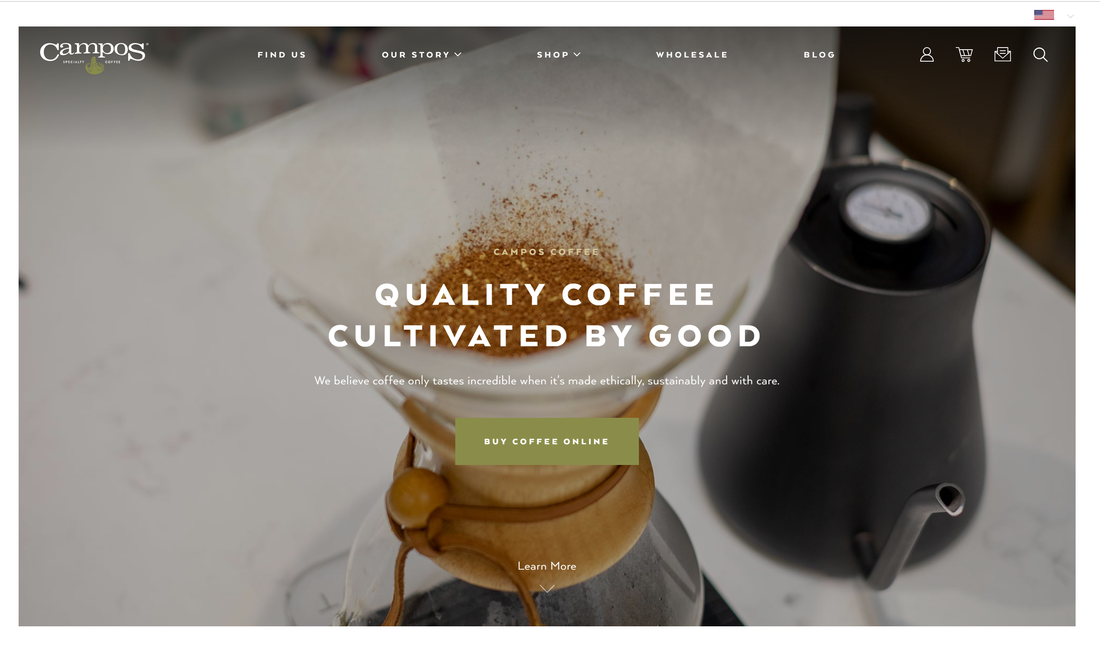
A website that truly tells the story of its product and brand, Campos Coffee. Although the website uses a variety of media outlets to showcase their mission and purpose, what really struck a chord with me was using the power of video to show what the company really is striving to achieve.
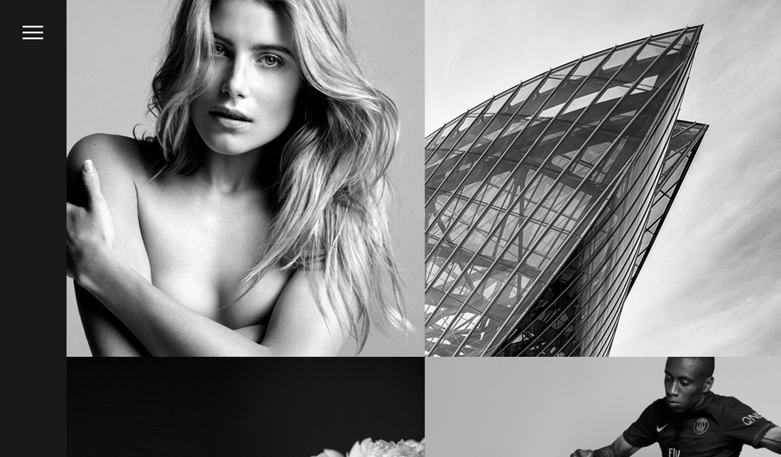
Sometimes a portfolio can be more powerful and personal than a company website, as shown by Jonathan Da Costa. Jonathan believes in connecting design, technology and digital storytelling to “deliver thoughtful and challenging concepts through a process of research and development”. His site shows how powerful a greyscale theme can be, and showcases his work beautifully. You can follow him onTwitter.
Want to feature your website, or suggest your favourite ones? Get in touch!